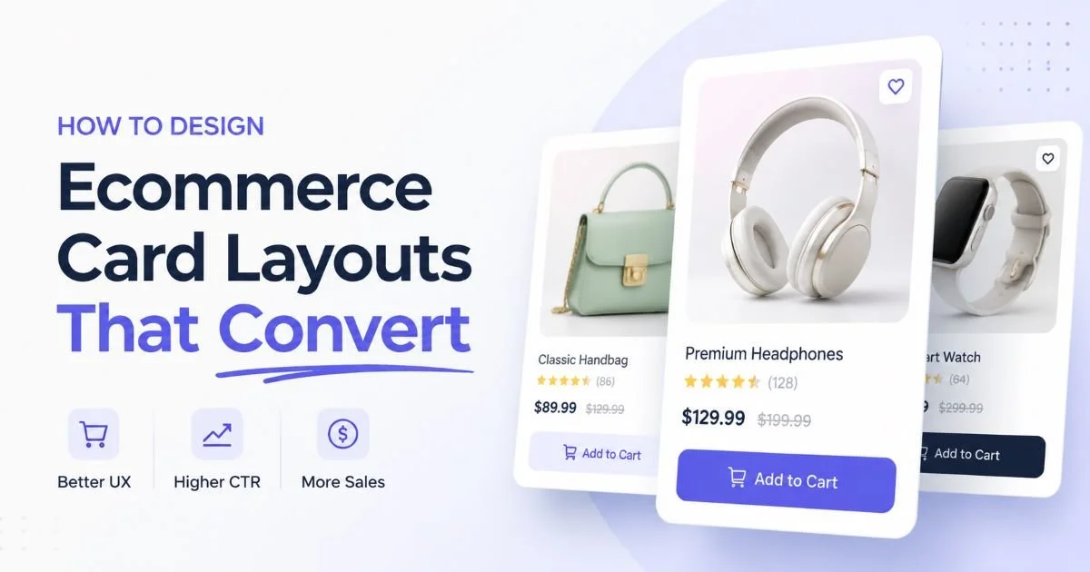
Design ecommerce card layouts sit at the intersection of visual appeal and conversion science. Every product grid your customers scroll through is built from individual cards, and each one either earns a click or gets ignored. The difference between a 2% and a 5% click-through rate often comes down to how you structure those small rectangular containers of information.
Whether you're building for a Shopify storefront, a custom marketplace, or a SaaS pricing page, the card is your primary unit of persuasion. Getting the hierarchy, spacing, and interactive elements right isn't just a design exercise; it's a revenue decision.
This guide walks you through four concrete steps to design ecommerce card layouts that actually move the needle on conversions. You'll leave with specific techniques you can apply to your next sprint, not vague platitudes about "clean design."
Key Takeaways
- Visual hierarchy inside each card directly controls where users look first and what they click.
- Product images sized at a 4:3 or 1:1 ratio consistently outperform freeform aspect ratios in grids.
- Badges and urgency labels can lift add-to-cart rates by 15% or more when used sparingly.
- Mobile card layouts need thumb-friendly tap targets of at least 44 by 44 pixels minimum.
- Testing two card variants against each other beats guessing every single time without exception.
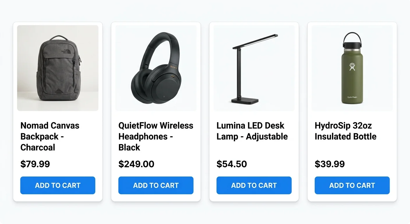
Step 1: Establish Visual Hierarchy Inside Your Card
Image First, Always
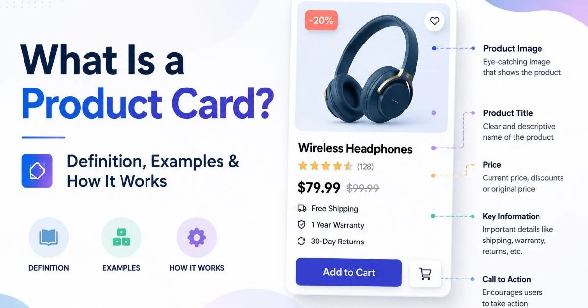
The product image is the single most important element on any ecommerce card. Eye-tracking studies consistently show that users fixate on the image before reading any text. Your image container should occupy roughly 60% of the card's total height on desktop. Use a consistent aspect ratio across all cards in a grid, because mismatched image sizes create a jagged, unprofessional appearance that erodes trust. Understanding what a product card is and how it works gives you a solid foundation before you start tweaking individual elements.
White or neutral backgrounds behind products perform better for most categories than lifestyle photography at the card level. Lifestyle images work well on product detail pages, but at the grid level you want fast visual scanning. Remove clutter from the image container. A clean product shot on a consistent background lets users compare items quickly, which is the entire point of a card grid layout.
Text and Price Stacking
Below the image, stack your text in a predictable order: product title, then a short descriptor or variant info, then the price. The title should be limited to two lines maximum with CSS truncation. Allowing titles to wrap unpredictably across three or four lines destroys vertical alignment in the grid. Use a semibold weight for the title (600 is a good starting point) and a slightly larger, bold weight for the price to make it pop.
Price formatting matters more than most designers realize. Always show the currency symbol, use a larger font size than the title (typically 2 to 4 pixels larger), and if there's a sale price, display the original price with a strikethrough immediately beside the discounted number. The contrast between the two creates an anchoring effect that psychologically increases perceived value. This small UI card component decision influences purchase behavior significantly.
Use a CSS clamp() function for responsive font sizing on card text, so titles and prices scale smoothly between breakpoints without media query overhead.
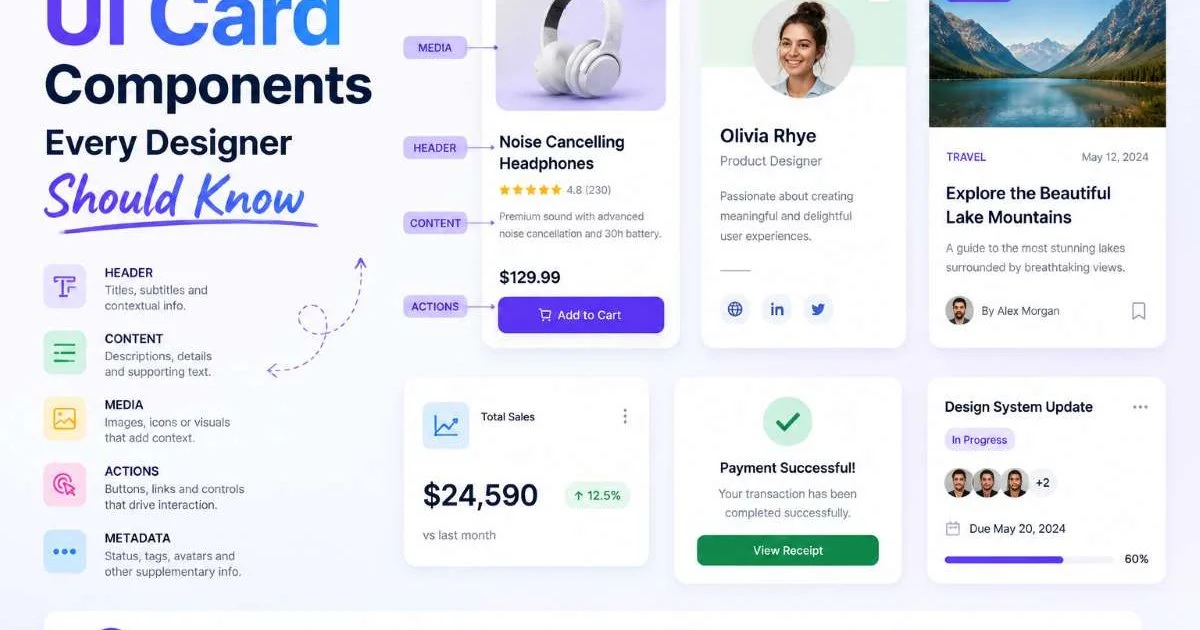
Step 2: Design Ecommerce Card Components That Drive Action
Badges and Social Proof
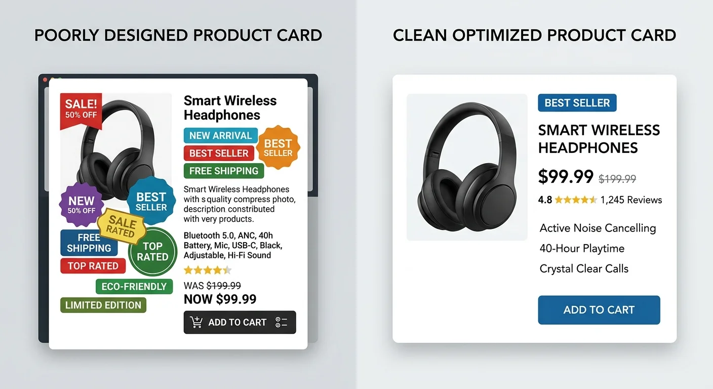
Badges are small overlays on the card that communicate urgency, status, or social proof. Common examples include "Sale," "New," "Bestseller," and "Low Stock." Position badges in the top-left corner of the image container, where they catch the eye during the natural left-to-right scan pattern. Limit yourself to one badge per card. Stacking multiple badges dilutes their impact and clutters the design. When you design ecommerce card badges, pick high-contrast color pairs (white text on a red or green background) for instant readability.
Star ratings and review counts serve as powerful social proof within product cards. A compact five-star display with a review count in parentheses (like "4.7 (238)") provides instant credibility without consuming much vertical space. Place this element between the title and the price. Shoppers on ecommerce platforms with built-in marketing tools often see conversion lifts when ratings appear directly on the card rather than only on the product page.
CTA Placement and Style
The call-to-action button is where conversion happens. For standard product cards, "Add to Cart" is the most effective label, beating alternatives like "Buy Now" or "Shop Now" in most A/B tests. Position the CTA at the bottom of the card, spanning the full width of the card's content area. A full-width button is easier to tap on mobile and creates a strong visual anchor at the base of every card in the grid.
Some ecommerce designers prefer a hover-reveal CTA, where the button only appears when the user mouses over the card. This approach keeps the grid visually clean, but it has a drawback: it's invisible on touch devices. If your analytics show more than 50% mobile traffic, always display the CTA by default. You can still add hover effects (a color shift, a slight scale) for desktop users, but never hide the primary action behind an interaction that doesn't exist on phones.
Never rely on hover-only interactions for primary actions. Mobile now accounts for over 60% of ecommerce traffic globally.
Step 3: Optimize Card Layout for Grid and Mobile
Grid Spacing and Columns
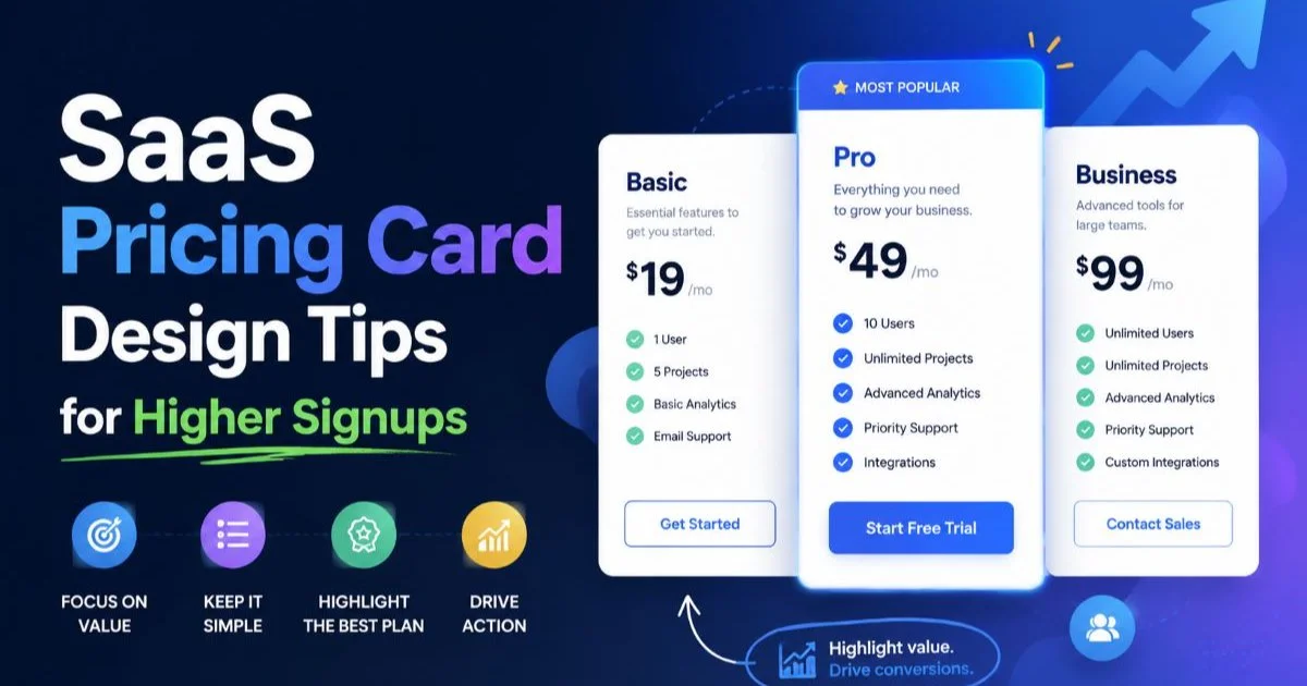
A well-structured card layout starts with your grid system. On desktop viewports (1200px and above), four columns is the sweet spot for most product grids. Three columns work better for cards with more content, like SaaS pricing cards that include feature lists. Use a consistent gap of 16 to 24 pixels between cards. Tighter gaps feel cramped; wider gaps waste valuable screen real estate and reduce the number of products visible above the fold.
CSS Grid is the right tool for modern ecommerce card layouts. A simple grid-template-columns: repeat(auto-fill, minmax(260px, 1fr)) declaration handles most responsive scenarios gracefully. This approach lets the browser figure out column count based on available space, which means fewer breakpoints and less maintenance. Set a max-width on each card of around 320px to prevent cards from stretching too wide on ultrawide monitors, where overly large cards look awkward.
"The card grid is your storefront window. Every pixel of spacing, every font weight choice, every badge color is a merchandising decision."
Mobile-Specific Adjustments
On mobile, switch to a two-column grid for product cards. Single-column layouts waste vertical space and force excessive scrolling, while three columns make cards too narrow to display meaningful content. At 375px viewport width (the most common mobile size), two columns with a 12px gap gives each card roughly 170px of width. That's enough for a clear product image, a truncated title, a price, and a compact CTA. Also, make sure your site is secure before launch; a quick review of website security scanning for small businesses can save you from trust issues that kill conversions.
Touch targets need special attention. Apple's Human Interface Guidelines recommend a minimum tap target of 44 by 44 points, and Google's Material Design specifies 48 by 48 dp. Your CTA button, wishlist icon, and any quick-view trigger should all meet or exceed these minimums. Cards that are easy to interact with on a phone convert better simply because users aren't accidentally tapping the wrong element or struggling with tiny icons. Test every interactive element with your thumb on a real device.
Always test card layouts on actual devices, not just browser emulators. Emulators don't replicate thumb reach zones, scroll momentum, or real rendering quirks.
Step 4: Test, Iterate, and Measure Card Performance
What to A/B Test First
When you design ecommerce card layouts, resist the urge to test everything simultaneously. Start with the highest-impact variables. Image size relative to the card is the first thing to test, because it affects every other element's position. Next, test CTA visibility (always visible versus hover-reveal). Third, test badge presence versus no badges. Each test should run for at least two full business cycles (typically 14 days) to account for weekday and weekend traffic pattern differences.
Use a structured testing framework. The table below ranks common card elements by their typical impact on conversion rate, based on published case studies from Baymard Institute and other UX research firms. Prioritize testing the elements at the top of this list before moving to lower-impact refinements. Product page design improvements are valuable, but card-level changes affect every product simultaneously.
Also Check: AI vs Manual Code Audits: Key Differences Explained
| Card Element | Typical Impact on CTR | Test Priority | Effort to Implement |
|---|---|---|---|
| Product Image Size | High (10 to 20%) | 1st | Low |
| CTA Button Visibility | High (8 to 15%) | 2nd | Low |
| Urgency/Sale Badges | Medium (5 to 15%) | 3rd | Low |
| Star Ratings Display | Medium (5 to 10%) | 4th | Medium |
| Price Font Size/Weight | Low to Medium (3 to 8%) | 5th | Low |
| Card Border/Shadow Style | Low (1 to 4%) | 6th | Low |
Metrics That Matter
Track three primary metrics for card performance: click-through rate (the percentage of users who click any card element), add-to-cart rate from the card grid, and revenue per visitor for pages using the card layout. Avoid vanity metrics like time on page, which tells you almost nothing about card effectiveness. A user who spends 30 seconds scanning a grid and adds two items to cart is far more valuable than someone who lingers for three minutes without clicking.
Set up event tracking on every interactive card element. Tag the image click, title click, CTA click, and wishlist/favorite action separately. This granular data reveals which part of your card is doing the heavy lifting. If 80% of clicks go to the image and almost none hit the CTA button, that tells you the button isn't earning its space and needs redesigning. Tools like Google Analytics 4 custom events or Mixpanel funnels make this straightforward to implement within a few hours of development work.
Create a shared dashboard showing card-level metrics that your entire product team can access, so design decisions are always backed by real data.
Frequently Asked Questions
?How do I apply CSS truncation to keep card titles to two lines?
?Should I use lifestyle photos or clean product shots at the card level?
?How long does it realistically take to A/B test two card layout variants?
?Can overusing urgency badges hurt conversions instead of helping them?
Final Thoughts
Every design ecommerce card decision you make is a small bet on user behavior, and the best teams validate those bets with data rather than intuition. Start with strong visual hierarchy, build your card components with conversion in mind, optimize for both desktop and mobile grids, and then test relentlessly.
The four steps outlined here give you a repeatable framework for improving card performance across any product catalog or SaaS pricing page. Ship your first variant this week, measure for two weeks, and iterate from there.
Disclaimer: Portions of this content may have been generated using AI tools to enhance clarity and brevity. While reviewed by a human, independent verification is encouraged.