Product card design is the practice of structuring visual and informational elements within a compact, self-contained UI component that represents a single item in a digital storefront, SaaS pricing page, or marketplace listing. If you've ever browsed an online shop and instantly understood a product's name, price, and value from a single glance at a rectangular block, you've experienced good product card design firsthand. These small components carry enormous weight.
They serve as the first real touchpoint between a potential buyer and whatever you're selling. A poorly designed card creates friction. A well-crafted one drives clicks, comparisons, and conversions. For e-commerce designers and developers, mastering this component is not optional; it's foundational to building interfaces that actually perform.
Key Takeaways
- Product card design directly impacts click-through rates and conversion across all digital storefronts.
- Every card needs a clear hierarchy: title, image, price, badge, and call-to-action.
- SaaS pricing cards require different information density than ecommerce product cards.
- Badges like "Best Seller" or "New" increase engagement when used sparingly and honestly.
- Consistent product card layout across your catalog builds trust and reduces cognitive load.
What Is a Product Card and How Does It Work?
Anatomy of a Product Card
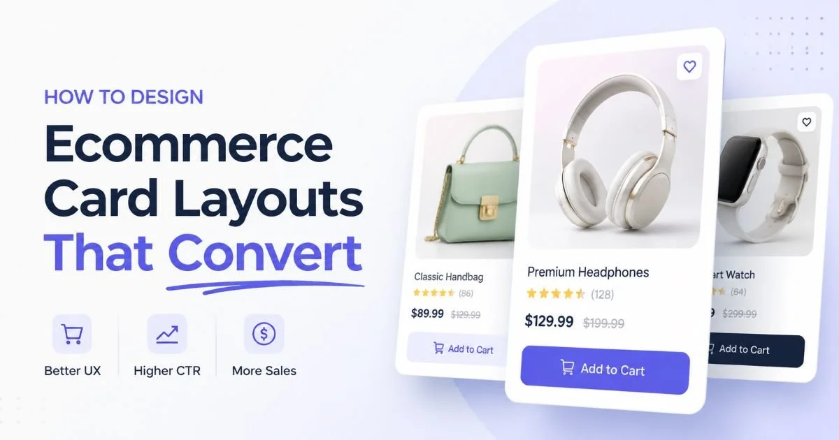
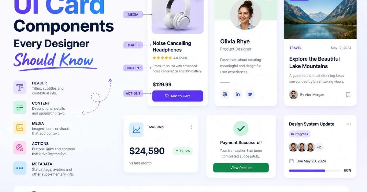
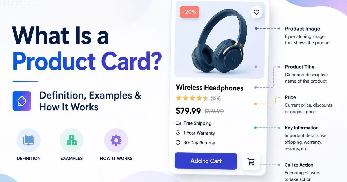
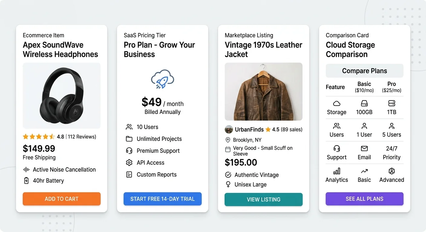
A product card is a modular UI component that displays key product information within a defined rectangular area. At minimum, it contains a title, an image or visual element, a price, and a call-to-action button. More sophisticated cards include badges (like "Sale" or "Popular"), star ratings, short benefit statements, and stock availability indicators. Each element serves a specific communication purpose, and removing any one of them forces the user to work harder to make a decision.
The visual hierarchy within a card matters more than most developers initially realize. The image typically occupies 40 to 60 percent of the card's vertical space because humans process images 60,000 times faster than text. The title sits directly below or beside the image, followed by pricing information. Badges are positioned as overlays on the image or near the title to draw immediate attention without disrupting the reading flow.
How the Pieces Fit Together
The CTA button anchors the bottom of the card, giving users a clear next step. Whether it reads "Add to Cart," "Start Free Trial," or "View Details," this button is the conversion mechanism. Its placement at the card's base follows the natural top-to-bottom scanning pattern that Western readers use instinctively. The spacing between elements, the font weight choices, and the color contrast all work together to make the card scannable in under two seconds.
Benefits or feature snippets, when included, typically appear as short bulleted text or icon-and-label pairs between the price and the CTA. These micro-descriptions answer the user's internal question: "Why should I care?" For ecommerce product cards, this might be "Free shipping" or "Organic certified." For SaaS pricing cards, it's features like "Unlimited users" or "API access." The card must answer the right questions for its specific context.
Test your product cards with a two-second scan. If a user can't identify the product name, price, and next action in that time, simplify your layout.
Why Product Card Design Matters for Shops, SaaS, and Marketplaces
Ecommerce and Marketplace Impact
In ecommerce, product card design is where browsing either converts into shopping or ends in a bounce. Research from the Baymard Institute shows that 69.82% of online shopping carts are abandoned, and a significant portion of that friction starts at the browsing stage. Cards that fail to communicate value, price clarity, or trustworthiness push users away before they even reach the cart. Marketplace product listings on platforms like Etsy or Amazon follow these same principles, though they operate under tighter layout constraints imposed by the platform.
Ecommerce platforms that integrate marketing tools often provide built-in card templates, but relying on defaults rarely produces optimal results. Custom product card layout decisions, like whether to show a secondary image on hover or where to position a discount badge, can move conversion metrics by measurable amounts. A/B tests on card layouts consistently show that small changes to element positioning produce 5 to 15 percent differences in click-through rates.
SaaS Pricing Card Differences
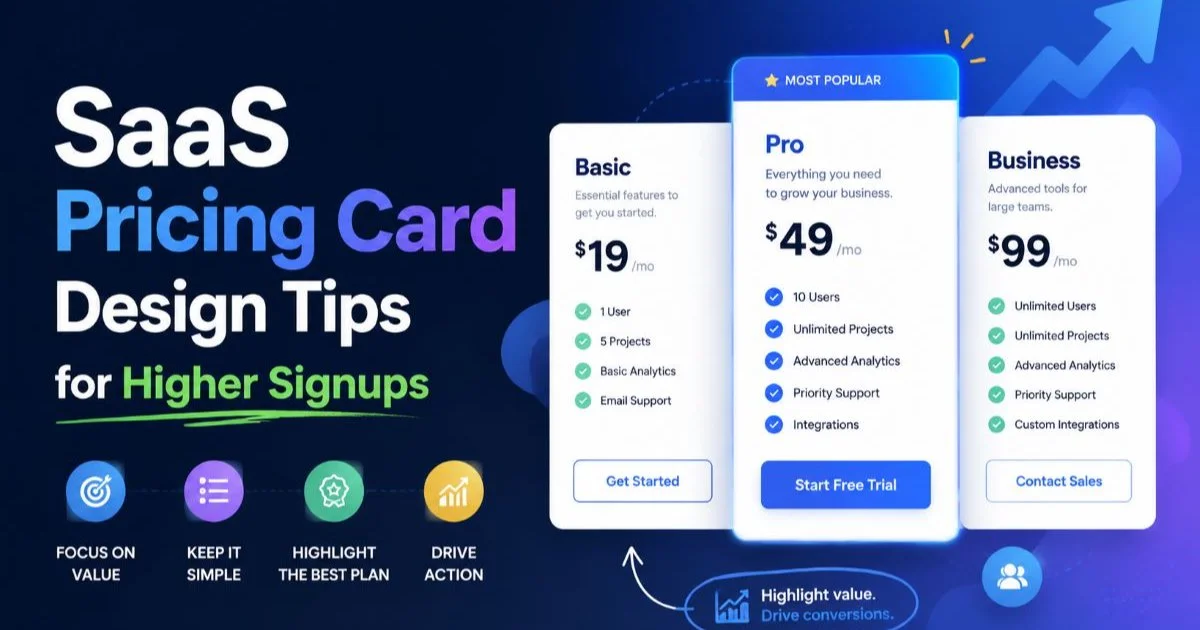
SaaS pricing cards operate under different rules than retail product cards. The "product" is intangible, so there's no hero image of a physical item. Instead, the card leads with a plan name (like "Starter" or "Enterprise"), followed by the monthly or annual price, and then a vertical list of included features. The visual emphasis shifts from imagery to typography and whitespace. The recommended or most popular plan is typically highlighted with a colored border, a "Most Popular" badge, or slightly larger dimensions to guide the user's choice.
Feature comparison across tiers is another unique challenge. Users need to quickly see what they gain by upgrading, which means your card design must handle both inclusion (checkmarks for available features) and exclusion (grayed-out or absent features) gracefully. Many SaaS companies use a horizontal row of three cards to facilitate instant comparison, a pattern so common it has become an expected convention. Breaking this convention requires strong justification.
Common Misconceptions About Product Cards
More Information Is Not Always Better
One of the most persistent myths in product card design is that packing more information into a card makes it more useful. The opposite is often true. Cards overloaded with specifications, multiple price breakdowns, lengthy descriptions, and several badges create visual noise. Users experience decision paralysis rather than clarity. The card's job is to communicate enough to earn a click, not to replace the full product detail page. Think of it as a movie trailer, not the full film.
Developers frequently make the mistake of treating every data point from the product database as card-worthy. Just because your CMS has fields for weight, dimensions, material, SKU number, and 14 tags doesn't mean all of those belong on the card. Ruthless editing is required. Show only what helps the user decide whether to learn more. For most ecommerce product cards, that's the image, title, price, one or two badges, and a clear CTA. Everything else belongs on the product detail page.
Displaying more than two badges per product card creates visual clutter and dilutes the impact of each badge. Pick the most relevant one or two.
Badges Are Not Decoration
Product badge ideas often get reduced to decorative elements, but effective badges serve a specific persuasion function. A "Best Seller" badge provides social proof. A "Limited Stock" badge creates urgency. A "New Arrival" badge signals freshness. Each badge type triggers a different psychological response, and stacking multiple badges on one card dilutes all of them. Use badges strategically, and rotate them based on actual data rather than gut feeling or aesthetic preference.
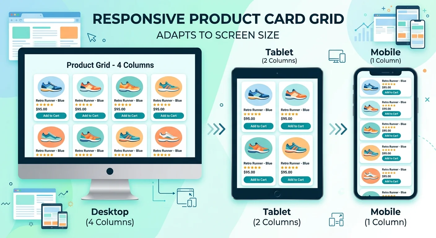
Another misconception is that product card layout is a "set it and forget it" decision. Cards should evolve based on performance data, seasonal changes, and shifts in user behavior. A card layout optimized for desktop browsing may fail completely on mobile, where vertical space is precious and thumb-reachable tap targets become critical. Responsive card design isn't just about scaling down; it's about rethinking what information matters at each viewport width and touch context.
Mobile product cards often perform better with a single-column layout and larger tap targets rather than a compressed grid that mimics desktop.
Building Better Cards: Practical Patterns and Examples
Layout Patterns That Work
The most reliable product card layout follows a vertical stack: image on top, then title, then price or pricing info, then optional badges or benefits, then CTA at the bottom. This pattern works because it matches the F-pattern reading behavior documented by Nielsen Norman Group. Horizontal card layouts, where the image sits to the left and text fills the right side, work well for list views but struggle in grid contexts where cards need to be compared side by side quickly.
Grid spacing between cards deserves as much attention as the card internals. Cards placed too close together feel crowded and make individual items harder to distinguish. A gap of 16 to 24 pixels between cards works well at most viewport sizes. Consistent card heights within a row prevent the "ragged edge" problem that makes grids look broken. If product titles vary in length, consider truncating with an ellipsis or setting a fixed title height with overflow handling.
Use CSS grid with auto-fill and minmax() for responsive product card grids that adapt naturally without breakpoint-specific overrides.
Real-World Examples Worth Studying
Shopify's default product cards in the Dawn theme use a clean vertical stack with generous whitespace, a subtle hover effect that reveals a secondary image, and a price displayed in a heavier font weight than the title. This hierarchy is effective because the price, often the primary decision factor, gets strong visual emphasis. Apple's product comparison cards on their Mac lineup page demonstrate how to handle complex feature comparisons within a card format without overwhelming the user.
| Element | Ecommerce Shop | SaaS Pricing Page | Marketplace Listing |
|---|---|---|---|
| Hero Image | Critical | Not used | Critical |
| Title/Plan Name | High | High | High |
| Price | High | Critical | High |
| Feature List | Low | Critical | Medium |
| Badge | Medium | Medium | Medium |
| Star Rating | Medium | Low | High |
| CTA Button | Critical | Critical | High |
| Seller Info | Not used | Not used | Medium |
Tools like Product Card AI Agent can accelerate the creation process by generating structured card content tools, including titles, descriptions, benefit lists, and badge suggestions, tailored to your specific product type. This is particularly useful when you're working with large catalogs where writing unique card copy for hundreds of items would be impractical. The generated output gives you a strong starting point that you can refine based on your brand voice and design system.
"A product card's job is to communicate enough to earn a click, not to replace the full product detail page."
Frequently Asked Questions
?How much vertical space should a product image take up in a card?
?How does a SaaS pricing card differ from an ecommerce product card?
?How long does it take to see conversion gains from improving card layout?
?Is adding more badges to a product card a good way to boost engagement?
Final Thoughts
Product card design sits at the intersection of visual design, information architecture, and conversion optimization. Whether you're building e-commerce product cards, saas pricing cards, or marketplace product listings, the fundamentals remain the same: clear hierarchy, purposeful element selection, and relentless focus on what helps the user take the next step.
Don't over-decorate, don't over-inform, and don't assume your first layout is your best one. Test, iterate, and let real user behavior guide your refinements.
Disclaimer: Portions of this content may have been generated using AI tools to enhance clarity and brevity. While reviewed by a human, independent verification is encouraged.