SaaS pricing card design is one of the most underestimated conversion levers on any software product page. When a potential customer reaches your pricing section, they've already shown intent. The question is whether your card layout, visual hierarchy, and messaging can push them from "interested" to "signed up."
Most SaaS companies treat pricing cards as an afterthought, copying competitors or slapping together a basic three-column grid. That's a mistake. Research consistently shows that small design changes on pricing pages can lift conversions by 10% to 30%.
For e-commerce designers and developers building SaaS products, this guide breaks down specific, actionable steps to create pricing cards that actually drive signups. Understanding how product cards work in practice gives you a foundation to apply these principles with confidence.
Key Takeaways
- Anchor your recommended plan visually with size, color, and badge differentiation.
- Limit pricing tiers to three or four options to prevent decision paralysis.
- Use benefit-driven feature lists instead of technical jargon on every card.
- Test CTA button copy and color independently from the rest of the page.
- Mobile-responsive card components are non-negotiable for modern SaaS signups.
Step 1: Structure Your Card Layout for Clarity
Choosing the Right Number of Tiers
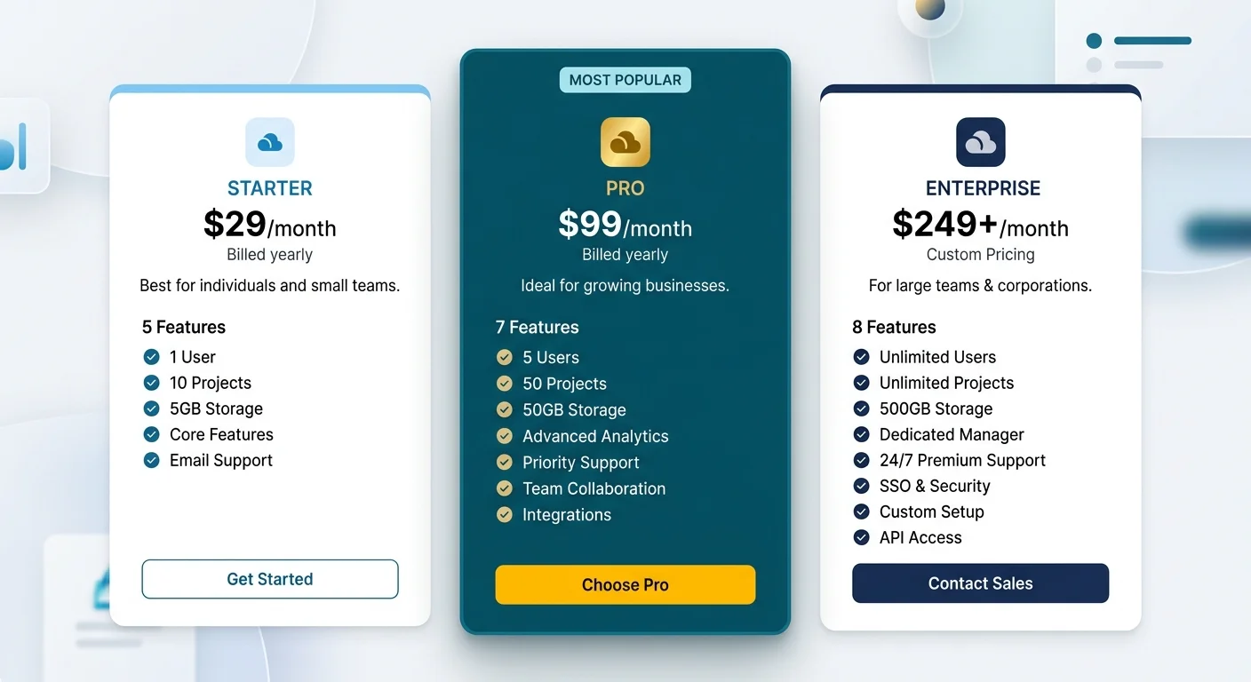
The number of pricing tiers you offer directly impacts conversion rates. Hick's Law tells us that more choices lead to longer decision times and higher abandonment. For most SaaS products, three tiers hit the sweet spot: a starter plan, a mid-tier "most popular" option, and a premium or enterprise plan. If you sell to vastly different market segments, four tiers can work, but anything beyond that introduces unnecessary friction into the decision process.
Each tier should serve a clearly defined persona. Your starter plan targets individual users or those exploring your tool. The mid-tier serves growing teams who need collaboration features. The premium plan targets organizations with advanced requirements like SSO, dedicated support, or custom integrations. When visitors can immediately identify which plan matches their situation, you remove guesswork. That self-selection process is what turns a pricing page into a signup machine.
Visual Hierarchy Within Each Card
Every pricing card needs a consistent internal structure. From top to bottom, the optimal order is: plan name, price, billing toggle (monthly vs. annual), a short value proposition, the feature list, and finally the CTA button. Consistent card layout across all tiers lets users scan horizontally and compare without cognitive strain. Inconsistent structures force users to hunt for information, which kills momentum at exactly the wrong moment.
White space is your best friend here. Cramming too many features into a card makes it feel overwhelming. Aim for five to seven bullet points per card, prioritizing the features that differentiate each tier. If you need to list more, consider a separate full comparison table below the cards. Products like Slack and Notion do this effectively, keeping their cards clean while providing detailed breakdowns for users who want them.
Use a toggle between monthly and annual billing directly above or within the cards, and show the annual savings as a percentage badge.
Step 2: Design UI Card Components That Guide Decisions
The Anchor Plan Technique
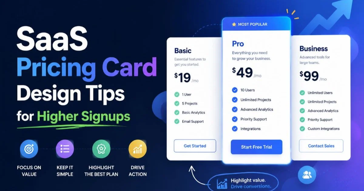
Your SaaS pricing card design should actively guide visitors toward your preferred plan. This is where anchoring comes in. The recommended plan (usually the mid-tier) should be visually distinct: slightly larger, a different background color, or elevated with a subtle shadow. Adding a "Most Popular" or "Best Value" badge reinforces the social proof angle. Studies from the Baymard Institute confirm that highlighted plans receive 20% to 40% more clicks than non-highlighted alternatives.
Color psychology matters here, but don't overthink it. Your primary brand color should appear on the recommended plan's CTA button, while secondary plans get a muted or outlined button variant. This creates a natural visual magnet. Avoid using red for CTAs on pricing cards; it triggers caution associations. Blue, green, and purple consistently perform well across SaaS product pages. Test your specific palette with real users before committing.
Feature Comparison Tables
Below your pricing cards, a detailed feature comparison table serves users who are deeper in their evaluation. This is particularly important for B2B SaaS where multiple stakeholders review pricing. The table should use checkmarks and crosses rather than long text descriptions. Group features into logical categories like "Core Features," "Collaboration," "Security," and "Support" to maintain scannability.
When building these UI card components, consider using progressive disclosure. Show the most important differentiators on the cards themselves, and let curious users expand or scroll to the full comparison. If you're choosing between ecommerce platforms for your SaaS storefront, the comparison between Shopify and Magento offers useful perspective on how different platforms handle pricing page flexibility and customization.
"The best pricing cards don't just display prices; they tell a story about value at each level."
Step 3: Write CTA Copy and Microcopy That Converts
Button Copy That Reduces Friction
Generic button text like "Submit" or "Buy Now" underperforms compared to specific, action-oriented alternatives. "Start Free Trial," "Get Started Free," or "Try Growth Plan" all outperform vague labels because they set clear expectations. The word "free" in CTA copy can boost click-through rates significantly when you actually offer a free trial or freemium tier. Never promise something your signup flow doesn't deliver; that destroys trust instantly.
Microcopy below the CTA button is equally powerful. Phrases like "No credit card required," "Cancel anytime," or "14-day free trial" address objections before they form. These small text elements function as trust signals, reducing the perceived risk of clicking. Place them directly beneath the button in a smaller, lighter font weight so they're visible without competing with the CTA itself.
The language on your SaaS pricing cards should mirror the vocabulary your target audience uses. If you sell to developers, technical terminology is fine. If your audience is marketers or small business owners, plain language wins. Run customer interviews or review support tickets to discover the exact phrases your users say when describing what they want. Then put those words on your cards. This alignment between user language and product page design creates instant recognition and reduces bounce rates.
A/B test CTA copy changes in isolation. Changing the button text and color simultaneously makes it impossible to attribute conversion lifts to either variable.
Consider adding a brief tagline under each plan name that frames the value proposition in one sentence. For example, Basecamp's pricing page uses a single line to explain who each plan serves. "For freelancers and personal projects" or "For growing teams that need advanced analytics" immediately helps visitors self-select. This tiny addition reduces time-to-decision by removing ambiguity about which plan fits their needs.
Step 4: Optimize SaaS Pricing Card Design for Mobile and Performance
Responsive Card Layout Patterns
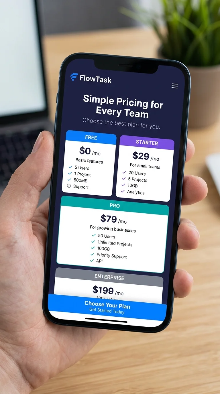
Over 55% of SaaS trial signups now originate from mobile devices, which means your pricing card design must work flawlessly on smaller screens. The standard three-column desktop layout should stack vertically on mobile, with the recommended plan appearing first. Use a swipeable carousel as an alternative, but always make sure the anchored plan is the default visible card. Accordion-style feature lists also help manage vertical space without hiding critical information.
Touch targets matter on mobile. Your CTA buttons should be at least 48 pixels tall, following Google's Material Design guidelines. Spacing between interactive elements needs to be generous enough to prevent accidental taps. Sticky CTA buttons that follow the user as they scroll through feature lists can significantly boost mobile conversions, especially on longer pricing cards where the button might otherwise scroll out of view.
Test your pricing cards on actual devices, not just browser emulators. Touch behavior and scroll performance differ meaningfully between simulators and real hardware.
Performance and Security Considerations
Page speed directly impacts conversions. Every additional second of load time reduces conversions by approximately 7%. Your ecommerce card layout and pricing components should load quickly, avoiding heavy JavaScript frameworks for what is fundamentally static content. Use semantic HTML, CSS Grid or Flexbox for layout, and optimize any images or icons used within the cards. Lazy loading below-the-fold content keeps the initial paint fast.
Security also plays a role in pricing page conversions. Displaying trust badges, SSL indicators, and compliance certifications (SOC 2, GDPR) near your pricing cards reassures buyers. For teams building SaaS products, understanding common website vulnerability types that scanners detect helps you protect the very pages where customers enter payment information. A single security incident on your pricing or checkout page can undo months of conversion optimization work.
Also Read: 10 Content Creation Tips for Writing Engaging How-To Guides That Rank on Google
Never store pricing logic or discount codes client-side in JavaScript. Savvy users can manipulate exposed pricing calculations to apply unauthorized discounts.
Frequently Asked Questions
?How do I apply the anchor plan technique without it feeling pushy?
?Can four pricing tiers work as well as three for SaaS signups?
?How long does it typically take to see conversion lifts from pricing card redesigns?
?Is it a mistake to list every feature on a pricing card to seem more transparent?
Final Thoughts
Effective SaaS pricing card design combines visual hierarchy, clear copy, strategic anchoring, and rock-solid mobile performance. None of these elements work in isolation; they reinforce each other. Start by auditing your current pricing page against the steps outlined here, then prioritize changes based on potential impact and implementation effort.
Test everything with real users, measure the results, and iterate. Your pricing cards are often the last thing a visitor sees before deciding to sign up or leave, so give them the attention they deserve.
Disclaimer: Portions of this content may have been generated using AI tools to enhance clarity and brevity. While reviewed by a human, independent verification is encouraged.