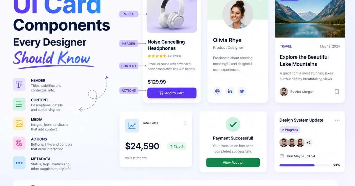
UI card components form the backbone of nearly every modern digital interface, from product grids on Shopify stores to pricing tiers on SaaS landing pages. If you design or develop for ecommerce, understanding how to build, customize, and deploy these components is not optional. Cards condense complex information into scannable, clickable units that drive user action.
Yet many teams treat cards as an afterthought, copying patterns without understanding why they work. The result is generic layouts that fail to convert. This guide walks you through four practical steps to master the card components that matter most, with specific techniques you can apply to your next project.
Whether you're building a product catalog or a subscription signup flow, these patterns will sharpen your design system and your conversion rates.
Key Takeaways
- Card anatomy has five core layers: image, title, metadata, CTA, and badge.
- Product cards and pricing cards require fundamentally different information hierarchies to convert.
- Responsive card grids need explicit breakpoint rules, not just percentage widths.
- Accessibility in card components directly impacts SEO ranking and user trust.
- Testing card variants with real users beats guessing which layout performs best.
Step 1: Understand Card Anatomy and Core Variants
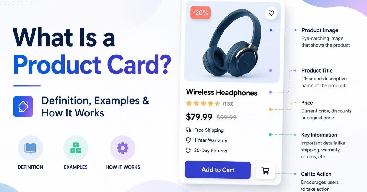
Every card component, regardless of its purpose, shares a common anatomy. At its simplest, a card contains an image region, a title, supporting metadata (price, rating, category), a call-to-action button, and optional badges like "Sale" or "New." Understanding this layered structure is foundational. For a thorough breakdown of what a product card is and how it works, start there before diving into advanced patterns. Once you internalize these layers, customizing them for different contexts becomes straightforward.
Product Card Structure
A standard ecommerce product card prioritizes the image above all else. Research from the Baymard Institute shows that 56% of users immediately explore product images upon arriving at a page. Your card's image container should maintain a consistent aspect ratio, typically 4:3 or 1:1, across the entire grid. Below the image, the product title and price sit in a tight hierarchy, with a visible "Add to Cart" or "Quick View" button anchoring the bottom. The differences between a card and a full product page design are significant, so don't try to cram page-level detail into a card.
Badges deserve special attention. A "Best Seller" or "Low Stock" badge adds urgency and social proof without requiring extra screen real estate. Place badges in the top-left corner of the image area for maximum visibility. Use no more than two badges per card; stacking three or four creates visual clutter that undermines trust. Color-code badges consistently across your entire catalog so returning users learn your system intuitively.
Use a maximum of two badges per card. Limit badge colors to three across your entire design system for consistency.
Pricing and Feature Cards
SaaS pricing cards follow different rules. The primary visual element is not an image but a plan name and price point, displayed prominently with large typography. Feature lists sit beneath the price, typically as bulleted checkmarks. The recommended plan gets a highlighted border or background color to guide the user's decision. For specific techniques on this pattern, the guide on SaaS pricing card design tips for higher signups covers layout, color psychology, and CTA wording in depth.
Feature comparison cards, common on SaaS product pages, function differently again. These wider, horizontal cards display a feature name, a short description, and an icon or illustration. They work best in single-column layouts where the user scrolls vertically through a narrative. Don't confuse these with pricing cards; mixing the two patterns creates cognitive friction that slows decision-making.
Step 2: Build Responsive Card Grids That Adapt
Breakpoint Strategy
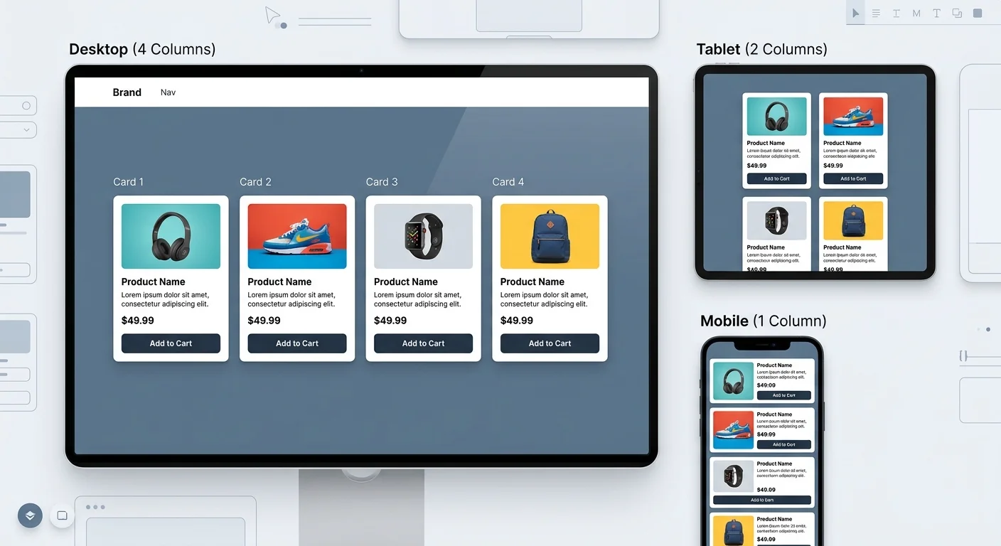
Card grids break when designers rely solely on percentage-based widths without defining explicit breakpoints. A four-column grid on desktop should collapse to two columns on tablet and a single column on mobile. Use CSS Grid with minmax() functions rather than fixed media queries alone. A practical starting point is grid-template-columns: repeat(auto-fill, minmax(260px, 1fr)), which naturally adapts to viewport width while preventing cards from becoming uncomfortably narrow.
For mobile product card design patterns, horizontal scroll carousels work well when you have more than six items in a category. On mobile, vertical stacking is the default, but a swipeable row lets users browse without endless scrolling. Test both patterns with real users. Analytics often reveal that mobile shoppers engage more with horizontal carousels for discovery, while vertical grids convert better when the user has already narrowed intent.
Handling Variable Content
One of the trickiest problems in card layout is variable content length. A product title that runs two lines on one card but three on another creates ragged rows that look unpolished. Set a fixed height for the title region using line-clamp (two lines is standard for most ecommerce grids). Truncate with an ellipsis, and provide the full title on hover or in a tooltip. This keeps your card grid visually uniform without hiding critical information permanently.
Price formatting also varies. "$9.99" is compact; "$1,299.00/month" is not. Allocate enough horizontal space in your card component for the longest realistic price string, and left-align prices consistently. When dealing with sale pricing, show the original price in strikethrough text directly beside the discounted price. This comparison is more effective at communicating value than a percentage-off badge alone, though combining both techniques yields the best results.
Always test your card layout with real product data, not placeholder text. "Lorem ipsum" hides layout bugs that surface only with actual titles and prices.
| Viewport Width | Columns | Card Min Width | Gap | Best For |
|---|---|---|---|---|
| 1200px+ | 4 | 260px | 24px | Desktop catalogs |
| 900px to 1199px | 3 | 260px | 20px | Small desktop, landscape tablet |
| 600px to 899px | 2 | 260px | 16px | Portrait tablet |
| Below 600px | 1 | 100% | 12px | Mobile phones |
Step 3: Optimize Cards for Conversion and Clarity
Visual Hierarchy Techniques
UI card components that convert well share a clear visual hierarchy. The user's eye should follow a predictable path: image, then title, then price, then CTA. Use font weight and size differences to enforce this order. The product title should be 16px to 18px in semibold; the price should be slightly larger or bolder. Supporting text like ratings or shipping info should be 12px to 14px in a muted color. This typographic ladder prevents the user from scanning past the CTA without registering it.
White space inside the card matters as much as the content itself. Padding between the image and the text block should be at least 12px. Internal margins between title, price, and CTA need 8px to 12px. Cards that feel cramped create subconscious resistance; users interpret dense layouts as "hard to use" even when the information is technically present. A well-spaced card looks premium and trustworthy, which directly influences purchase decisions on ecommerce sites.
Also Check: What Is SSL Certificate Checker? A Complete Guide
"A well-spaced card looks premium and trustworthy, which directly influences purchase decisions."
Microcopy and CTA Placement
The CTA button on a product card should use specific, action-oriented text. "Add to Cart" outperforms "Buy Now" in most ecommerce contexts because it implies lower commitment. For SaaS pricing cards, "Start Free Trial" converts better than "Sign Up" because it communicates value and reduces perceived risk. Test your CTA copy with A/B tools; even small wording changes can shift click-through rates by 10% to 20%. Prototyping these variants quickly is easier with AI-powered UI design tools that generate card mockups in seconds.
Anchor the CTA to the bottom of the card using flexbox (margin-top: auto on the button wrapper). This way, even when content lengths vary, every card in the row has its button at the same vertical position. Aligned CTAs across a grid create a visual "action row" that the user's eye naturally follows, increasing the likelihood of interaction. Never float the CTA mid-card; it disrupts the scanning pattern and gets lost among metadata.
Designing ecommerce card layouts that convert also means knowing what to leave out. Avoid adding share buttons, wishlists, and color swatches all at once. Each additional interactive element competes with your primary CTA. If you must include secondary actions, use icon-only buttons positioned in the card's top-right corner, visually subordinate to the main action button.
Limit interactive elements on each card to one primary CTA and no more than two secondary actions (like wishlist or quick view).
Step 4: Make Cards Accessible and Performant
Semantic Markup Matters
Card components often ship as a pile of nested <div> elements with no semantic meaning. This hurts both accessibility and SEO. Wrap each card in an <article> element. Use heading tags (<h3> or <h4>) for product titles. Mark up prices with <data> elements and structured data (JSON-LD) so search engines can parse your product information accurately. Ensuring your technical SEO fundamentals are solid means your card-heavy pages actually get indexed and ranked properly.
Keyboard navigation is another area most card implementations neglect. Each card should be reachable via Tab key, with a visible focus ring on the interactive element. If the entire card is clickable, use a single <a> tag wrapping the card content rather than attaching a click handler to the outer div. Screen readers announce the link text, so the product title inside that anchor becomes the accessible name. Test with VoiceOver or NVDA before shipping.
Making entire cards clickable via JavaScript click handlers instead of native anchor tags breaks keyboard navigation and screen reader support.
Performance Budgets for Card-Heavy Pages
A category page displaying 40 product cards with high-resolution images can easily exceed 5MB in total page weight. Lazy-load images below the fold using the native loading="lazy" attribute. Serve images in WebP or AVIF format at the exact dimensions your card layout requires, not the original 2000px upload. A good target is keeping each card image under 50KB. These optimizations alone can cut page load time by 40% to 60%, which improves both user experience and search rankings.
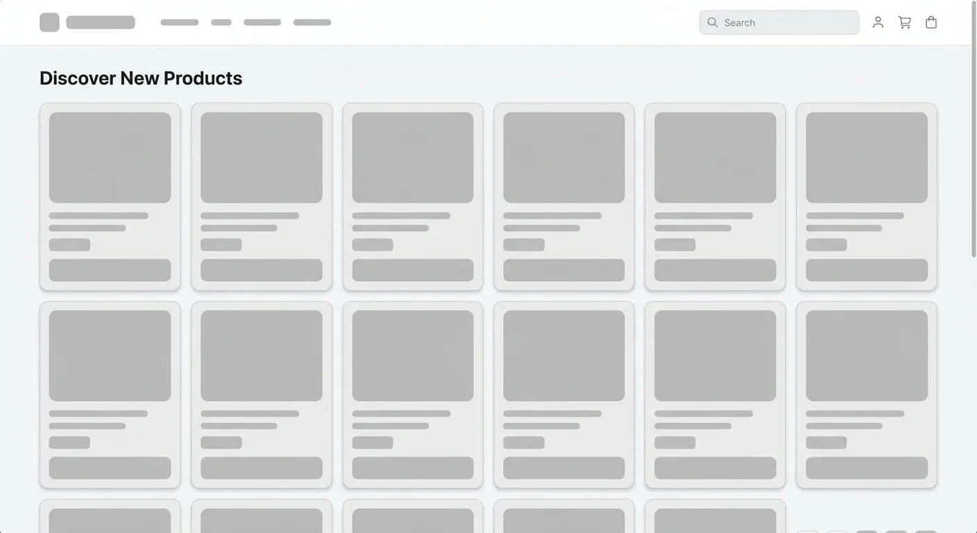
Component-level performance also matters. If you're rendering UI card components with a JavaScript framework like React or Vue, virtualize long lists using libraries like react-window or vue-virtual-scroller. Rendering 200 card DOM nodes simultaneously causes jank on mid-range devices. Virtualization renders only the visible cards plus a small buffer, keeping the DOM lean. Combine this with skeleton loading states that match your card dimensions to prevent layout shift during data fetching.
Finally, audit your card components periodically. Run Lighthouse on your card-heavy pages and check for Cumulative Layout Shift scores above 0.1. Cards that resize or reflow after images load create a jarring experience. Set explicit width and height attributes on image elements, or use CSS aspect-ratio to reserve the correct space before the image arrives. These details separate polished, production-ready card systems from fragile prototypes.
Run Lighthouse audits quarterly on your highest-traffic card grid pages. Performance regressions creep in as new products and images are added.
Frequently Asked Questions
?How do I set consistent aspect ratios across a product card grid?
?How is a pricing card's hierarchy different from a product card's?
?How long does it realistically take to test card variants with real users?
?Is using more than two badges per card really a problem?
Final Thoughts
Mastering UI card components is a practical skill that pays dividends across every project you touch. The four steps here, understanding anatomy, building responsive grids, optimizing for conversion, and shipping accessible, performant code, give you a complete framework.
Start with your existing card designs, audit them against these principles, and iterate. The best card systems evolve through real-world testing, not theory alone. Build thoughtfully, measure relentlessly, and your cards will do what they're supposed to do: turn browsers into buyers.
Disclaimer: Portions of this content may have been generated using AI tools to enhance clarity and brevity. While reviewed by a human, independent verification is encouraged.