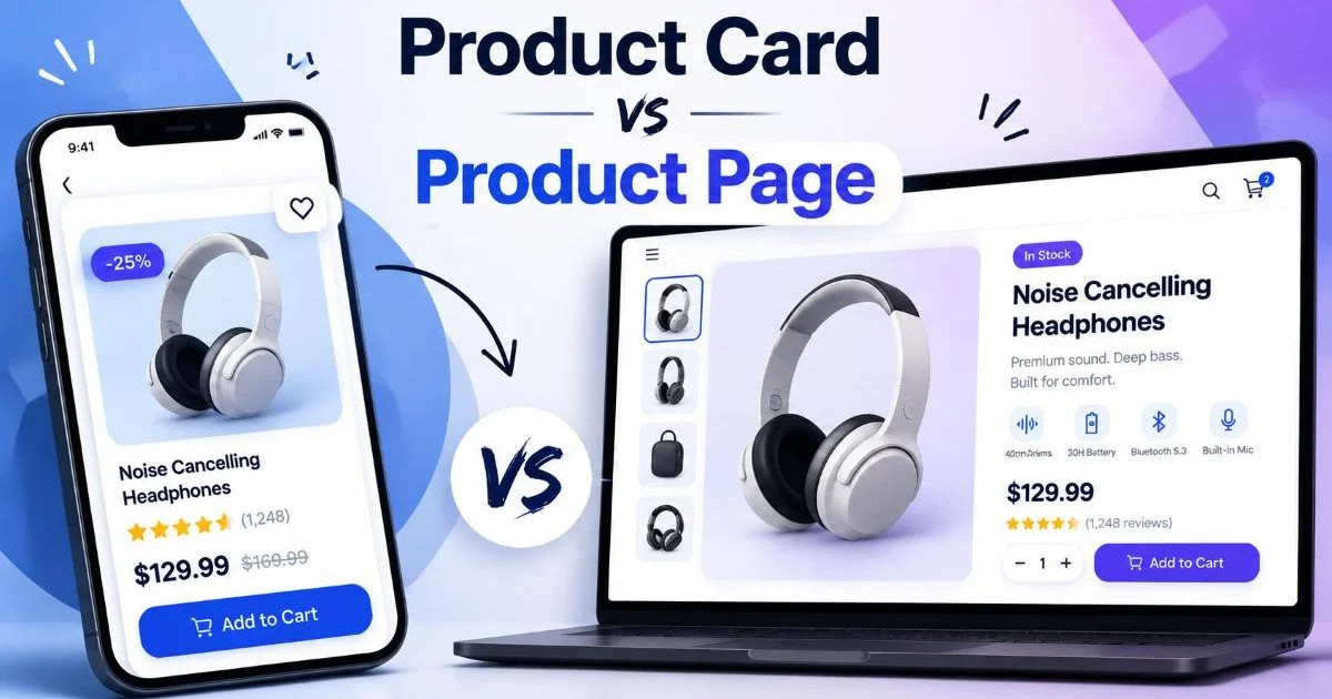
A product card and a product page serve fundamentally different roles in ecommerce and SaaS interfaces, yet many designers treat them as interchangeable. The product card is your storefront window: compact, scannable, and built to attract clicks.
The product page is your sales floor: detailed, persuasive, and engineered to close the deal. Understanding where one ends and the other begins can dramatically affect conversion rates, bounce rates, and overall user experience.
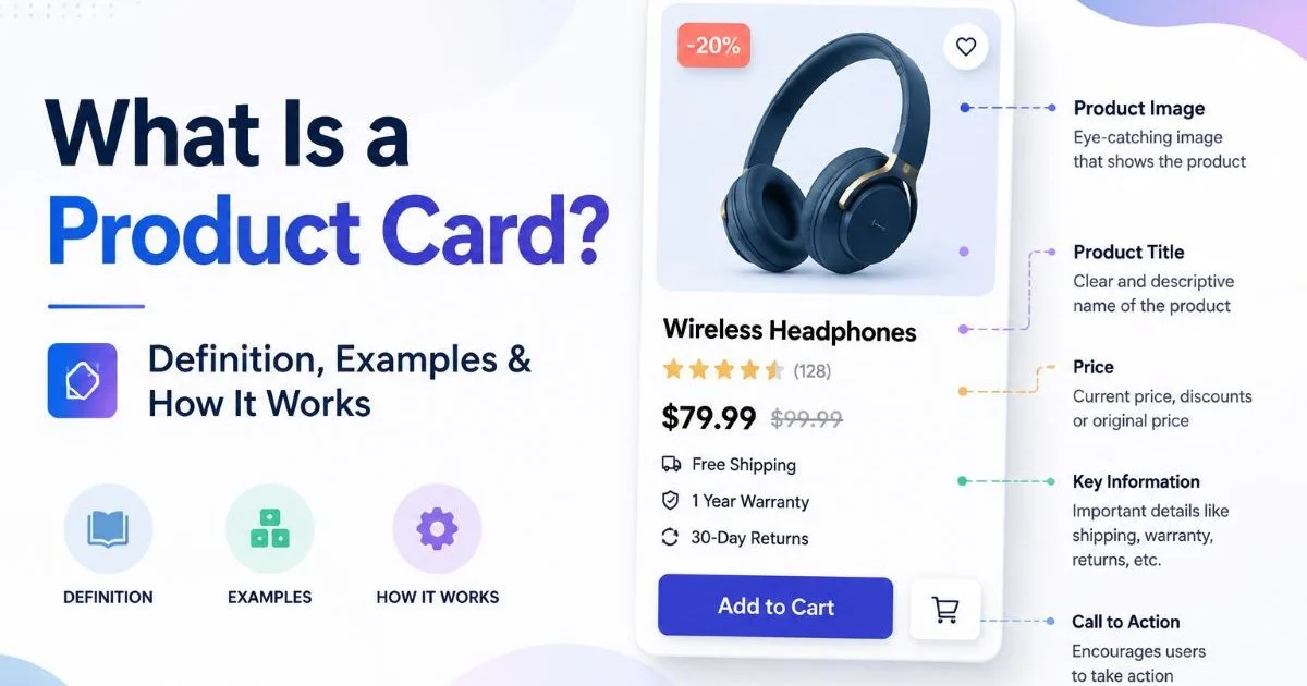
If you're designing for online shops or SaaS platforms, getting this distinction right separates good UI from great UI. As explored in our guide on what a product card is and how it works, these compact components carry surprising strategic weight. This article breaks down the differences across four key dimensions so you can make smarter design decisions.
Key Takeaways
- Product cards prioritize speed and scannability; product pages prioritize depth and persuasion.
- Card components should include only the essentials: image, title, price, and CTA.
- Product pages need reviews, specifications, and multiple media assets to convert buyers.
- Mobile card layout patterns differ significantly from mobile product page patterns.
- Both elements must work together as a unified conversion funnel, not in isolation.
Purpose and User Intent
Card: The Hook
The product card exists at the browsing stage. Users scrolling through a category listing or search results page are not ready to buy. They are filtering, comparing, and making snap judgments. Your card needs to answer one question in under two seconds: "Should I click this?" That means every pixel must earn its place. A well-designed card reduces cognitive load and encourages exploration without overwhelming the shopper with details they don't need yet.
Think of cards on platforms like Amazon or Shopify storefronts. They show a thumbnail image, a truncated product title, a price, and maybe a star rating. That's it. The card's job is click-through, not conversion. Adding too much information, like full descriptions or shipping details, actually hurts performance because it slows down the scanning process users rely on when browsing dozens of options simultaneously.
Limit product card text to 60 characters for the title and show no more than three data points beyond the image.
Page: The Closer
The product page picks up where the card left off. By clicking through, the user has signaled genuine interest. Now they need reassurance, detail, and social proof. The product page must address objections, showcase features, and guide the visitor toward adding an item to their cart. This is where you include size charts, material descriptions, customer reviews, and return policy information. The page is your digital salesperson.
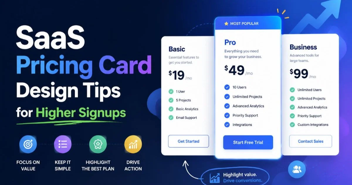
For SaaS products, the equivalent shift happens between pricing cards that drive signups and the full feature comparison or onboarding page. The pricing card captures interest; the landing page seals the commitment. Both stages demand distinct design strategies, and conflating them creates friction that costs you conversions.
Content Density and Components
What Belongs on a Product Card
Card components should be ruthlessly minimal. The essential elements are a product image, product name, price, and a primary call-to-action (either a "View" link or an "Add to Cart" button for quick-add flows). Optional but common additions include a star rating summary, a badge (like "Sale" or "New"), and a wishlist icon. Anything beyond this list starts to clutter the card and undermine its core function of fast scanning.
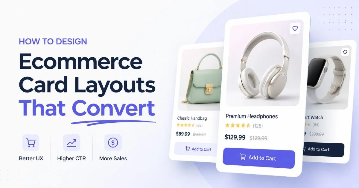
Color swatches can work on product cards for fashion ecommerce, but only when implemented as small, unobtrusive dots. Avoid embedding full descriptions, bullet-point feature lists, or dropdown selectors directly into the card. These elements belong on the product page. If you're interested in practical component strategies, our article on ecommerce card layouts that convert covers this in depth.
What Belongs on a Product Page
Product pages thrive on information density, but organized thoughtfully. The hero section typically features an image carousel or video alongside the title, price, and primary CTA. Below that fold, you layer in product descriptions, specifications tables, customer reviews, related product recommendations, and FAQ sections. Each block serves a specific objection-handling purpose in the buyer's decision process.
For SaaS, the product page equivalent often includes feature breakdowns, integration lists, testimonial blocks, and interactive demos. The key difference from the card is that every section here expects the user to spend time reading. You're not fighting for a click anymore; you're fighting for a commitment. Structure the page so the most persuasive content appears highest, with supporting details available for those who scroll further.
Don't hide critical information like pricing or availability behind tabs on the product page. Users who can't find the price within three seconds often bounce.
Layout and Visual Design
Grid-Based Card Layouts
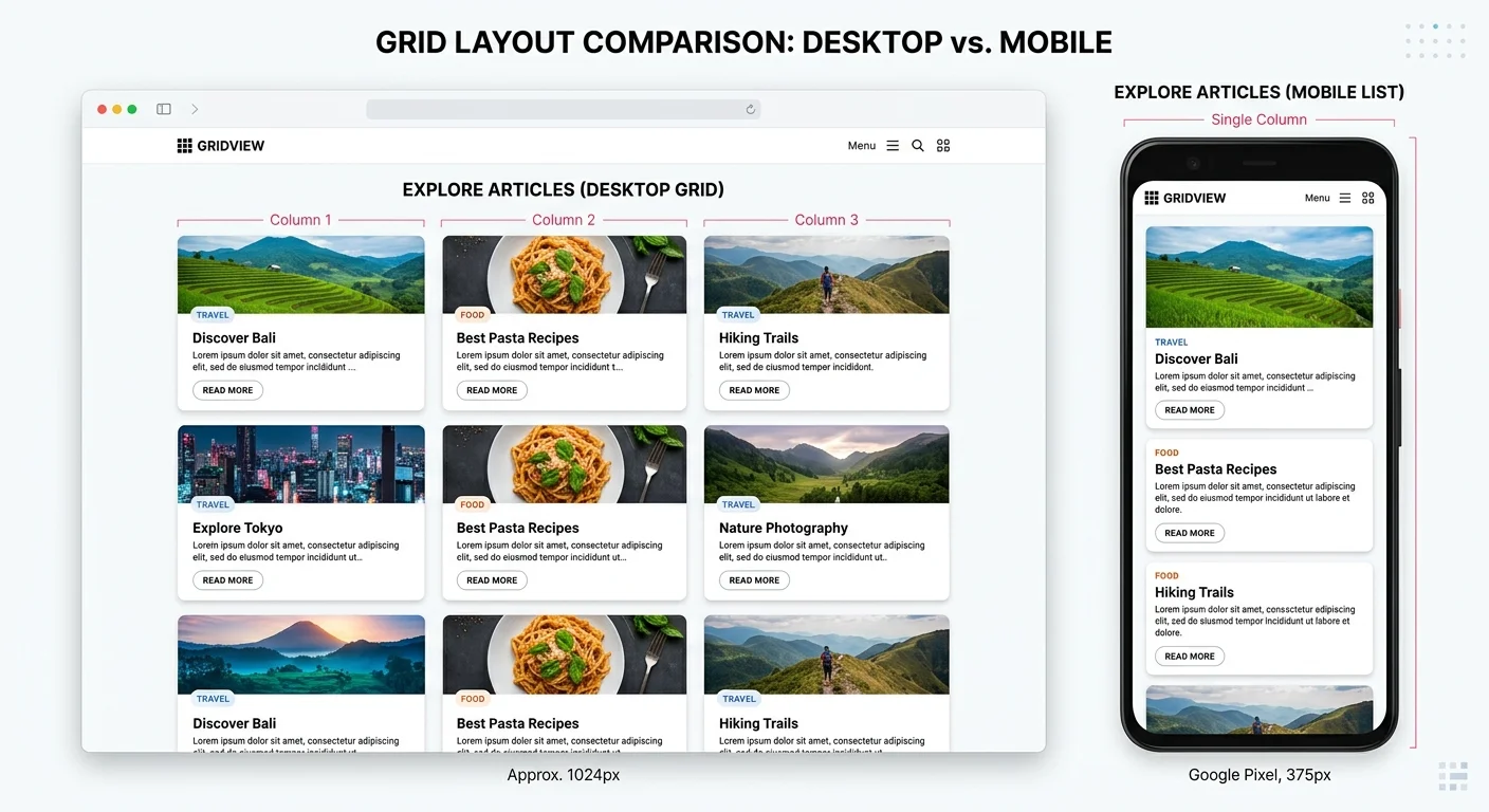
Product cards almost always live inside grid systems. Whether it's a three-column desktop grid or a two-column mobile layout, cards are designed as repeating, uniform units. This uniformity is a feature, not a limitation. Consistent card dimensions allow users to compare products visually without adjusting their scanning pattern. The card layout should use fixed aspect ratios for images and consistent typography sizing so nothing feels jarring as the eye moves across the grid.
On mobile devices, mobile product card design patterns often shift to single-column layouts or horizontal scroll carousels. Touch targets need to be at least 44x44 pixels, and the card's tap area should encompass the entire surface, not just a small "View" link. Whitespace between cards matters too. Crowding cards together creates visual noise; generous spacing improves both readability and perceived quality.
Single-Focus Page Layouts
Product pages break free from grid constraints entirely. The layout is singular and focused on one item. Desktop product pages typically use a two-column layout: image gallery on the left, product details on the right. Below the fold, content stretches to full width for descriptions, reviews, and recommendations. This asymmetric design guides the eye naturally from visual (image) to informational (details) to social proof (reviews).
The visual design language shifts too. While cards rely on contained borders, subtle shadows, and rounded corners to define boundaries within a grid, product pages use section dividers, background color changes, and generous vertical spacing to separate content blocks. Typography scales up significantly: product titles on pages can be 24 to 32 pixels, compared to 14 to 16 pixels on cards. This reflects the changed context where the user is focused, not scanning.
| Design Attribute | Product Card | Product Page |
|---|---|---|
| Typical Width | 200 to 350px | Full viewport |
| Image Aspect Ratio | 1:1 or 4:3 | Variable, often 3:4 |
| Title Font Size | 14 to 16px | 24 to 32px |
| Number of CTAs | 1 | 2 to 4 |
| Content Scroll Depth | None (fixed height) | 3 to 8 screen heights |
| Interaction Type | Click/Tap through | Add to cart, wishlist, share |
Performance and Conversion Impact
Speed Matters for Cards
Because product cards render in bulk (often 20 to 60 per page), their performance impact is amplified. Every kilobyte of image weight, every unnecessary DOM element, and every render-blocking script gets multiplied across every card on the listing page. Lazy loading images, using WebP or AVIF formats, and keeping card HTML lean are non-negotiable practices. A category page that loads slowly loses shoppers before they ever reach a product page.
Core Web Vitals scores suffer heavily from poorly optimized card grids. Cumulative Layout Shift (CLS) spikes when card images load without defined dimensions. Largest Contentful Paint (LCP) degrades when hero cards above the fold use oversized images. For a deeper look at how speed optimization affects these metrics, this resource on speeding up your site's Core Web Vitals offers practical guidance that applies directly to card-heavy listing pages.
Avoid loading all card images eagerly. Use native lazy loading (loading="lazy") for any card below the initial viewport fold.
Depth Matters for Pages
Product page performance is measured differently. While speed still matters, the emphasis shifts toward engagement metrics: time on page, scroll depth, add-to-cart rate, and ultimately conversion rate. A product page that loads in 1.5 seconds but fails to present compelling content will underperform a slightly slower page with better photography, detailed descriptions, and authentic reviews. Content quality on the page directly correlates with revenue per visitor.
AI-powered tools are increasingly helping teams generate and optimize product page content. From automated description writing to LLM-powered mobile apps that help merchandisers draft copy on the go, the barrier to creating rich product pages keeps dropping. But automation should supplement good design thinking, not replace it. The page structure, visual hierarchy, and strategic placement of trust signals all require human judgment and testing to get right.
Also Read: EU AI Act High-Risk AI Systems Explained Simply
"The card earns the click; the page earns the conversion. Neither can succeed without the other."
A/B testing reveals consistent patterns across ecommerce verticals. Cards that show prices outperform cards that hide them. Cards with badges ("Bestseller," "Limited Stock") see 12 to 15 percent higher click-through rates than those without. On product pages, user-generated photos in reviews increase conversion rates by up to 25 percent compared to pages with only professional photography. These data points reinforce the idea that each element requires its own optimization strategy.
Frequently Asked Questions
?How do I decide which data points to show on a product card?
?Is a SaaS pricing card designed differently than an ecommerce product card?
?Does adding more detail to a product card ever improve conversions?
?What's the most common design mistake when building product cards?
Final Thoughts
Product cards and product pages are partners, not competitors. The card's job is attraction and filtering; the page's job is persuasion and conversion.
Designing them requires different mindsets: cards demand restraint and speed, while pages demand depth and trust-building.
Treat them as two stages of a single funnel, and optimize each for its specific role. When both work in harmony, you'll see measurable improvements across click-through rates, engagement, and revenue.
Disclaimer: Portions of this content may have been generated using AI tools to enhance clarity and brevity. While reviewed by a human, independent verification is encouraged.